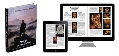
The Master and His Apprentices is a Christian-viewpoint program. It is arranged in a manner that helps coordinate Biblical and historical timelines. This is not unlike a few other of our courses, and I like this perspective. My school experience was learning things in "parallel universes." Cognitively, I knew that there is overlap in multiple civilizations, but I never tied it all together. When Jude started working on a particular history program, I discovered the idea of teaching "within a timeline" and discovered how much easier it is to understand how civilizations segue from one to the other. I liked the idea of starting at the beginning (Creation) and then studying art's progression through time.
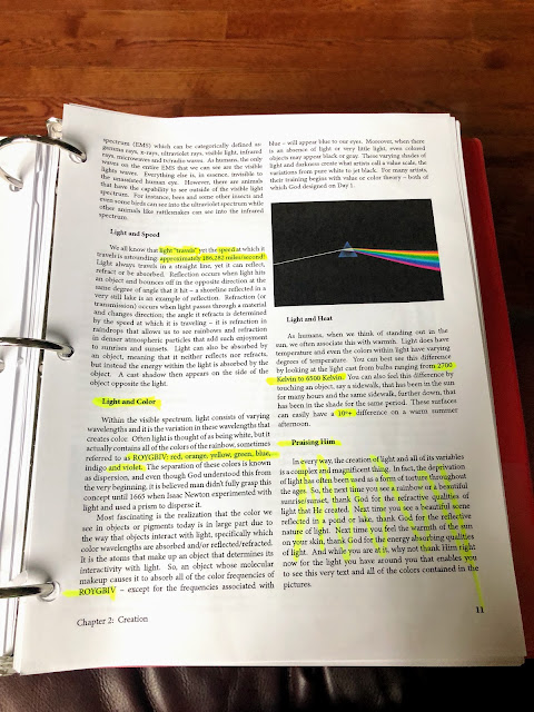
For our review, we received a Digital Edition of the curriculum, which included the Textbook ($34.99 retail) and Teacher Guide ($19.99). This is a downloadable PDF file that can be viewed on (ideally) a computer screen or a large-format tablet. The file is also formatted for printing; the appropriate margin has been left for a 3 hole punch binder or comb binding. While it took a considerable amount of time and ink, Matthew preferred a printed copy of the text, which would allow him to mark it for studying.
The guide includes a single-student license; there is $2 "recopy" fee for use with each subsequent student. (Reviewers received unlimited household recopy rights.) I can understand the company's view - this program is an investment in their intellectual material - but I don't like the idea of having to go back to the company every time I want to re-use a digital program. As a parent, I'd rather pay a few dollars more at the beginning for an unlimited single-household license, rather than feel "nickel-and-dimed" over time.
There is also a pre-printed materials option. This includes a 380-page hardcover Textbook ($149.99) and softcover, perforated-page, 120-page Teacher Guide ($24.99). The teacher's guide is intended to be a consumable material, but digital student reprint rights are available as well ($2 per student). Again, this feels clunky. I can understand the workbook being consumable. However, if I'm purchasing something pre-printed, it's because it's more cost-effective (either financially or time-wise) than printing it myself. If the paper guide were less expensive, I'd be more inclined to just purchase multiples of those and be done.
I can understand a per-student charge for non-family group settings (one suggested use of this is with co-op programs), but perhaps that should be a different "call us for pricing" category since the photocopy rights only apply to the workbook; each student still needs to purchase a textbook. I'm also not sure about the textbook and re-printing capability for later students.
Working with the program
I think this should be retitled Western Art History from a Christian Perspective, or even "Western History Through Art". I had expected this to cover art from around the world, not just the Middle East and Latinized areas. There is a single 8-page chapter devoted to "the rest of the world," with an explanation that "In a collegiate setting, the study of Western art and non-Western art are quite often divided into separate classes." (p. 314) That makes sense to me because there is no way that the entirety of art history, when presented in this timeline-based manner, could be done adequately within a single semester. However, neither the company's website nor samples indicate that there is little attention given to non-Western art. A mere eight pages are included and meant to point out other cultures; it feels like an "oh yeah, there's this other stuff" afterthought. I think it would be better to omit it entirely and advertise this program as a history of western art.
The book also mentions "Through Modern Times" in the title. However, it ends with the Baroque era and covers from Rococo (the 1700s) to current times in 8 pages. Impressionism - with the greats such as Renoir, Monet, Rodin, and Sargeant - gets a full page, while post-impressionist Van Gogh earns a small example picture and half a sentence. Again, if it had advertised itself as "Through the Baroque Era," I would be fine with that. But if it says "Through Modern Times," then I expect to find at least a mention of artists such as John Singer Copley and Charles Wilson Peale, and discussion of the establishment of the Pennsylvania Acadamy of Fine Arts, the oldest art institution in the United States and one of the first to allow women to receive an arts education equal to their male peers.
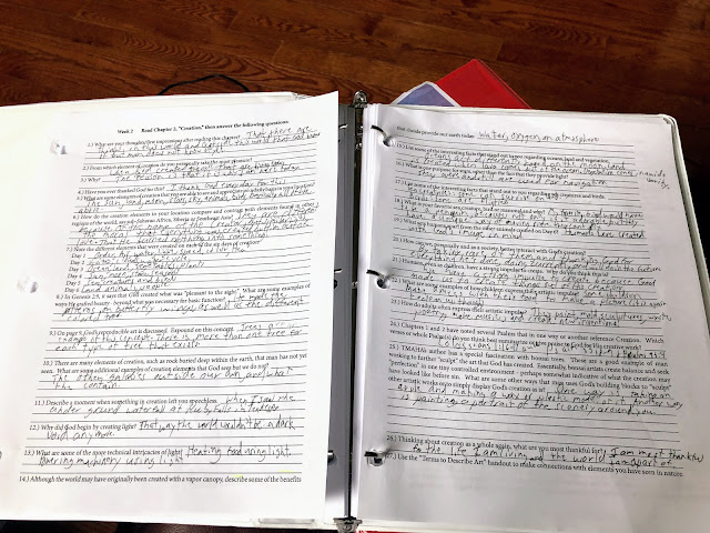
The program also includes four written research papers and four exams. I appreciated the clear "What to do each week" layout. I'm not certain what semester the dates included were from -- my guess is this was used with a co-op in a particular year, and these are the corresponding dates. Practically speaking, it was not a big deal to cross out the printed dates and re-mark the ones that aligned with our work. There is a note in the corner that this is a sample and there is an editable document available, but that just was an extra step that really seemed more than needed. (Plus, it involved printing another page.) However, it made the guide seem less "professional" and more "I'll just sell copies of my notes."
The teacher's guide heavily weights "discussion" - I think this works better in a group setting than a single student. The manual discusses how to use the program in both a one-hour class setting or a longer meeting period. However, for the single-student, it's awkward. The only person Matthew had to discuss things with was me, and he would look at me and say "I answered the questions, I don't have anything to really add." I think having a group of people with different perspectives would make a difference in how engaging the material could be.
"No Nudity"
One of my primary concerns with the program is it explicitly advertises "No nudity!" I felt that Ancient Greece, often filled with nude statuary, could focus on draping, and how artists and sculptors skillfully used light and shadow to create movement in folds of robes. But how does one effectively teach Renaissance art without using any nudes? There are nudes on the ceiling of the church where the Pope is elected! How does any Art History course worth its salt gets around Michelangelo's David?
By picturing only his left foot.
This was just ridiculous. This is a high-school level program. I'm not an advocate of gratuitous nudity, but nudity in art serves a purpose. In the Renaissance, it showed not only the skill of the artist in creating work but also reflected the emerging understandings in math and science of both the body itself and how to arrange it on canvas or in stone proportionally and realistically. (Later in the Baroque era, it reflects the changing attitude of the times.) David is probably one of the premier specimens of this Renaissance knowledge, as well as an incredible example of general line, movement, and the dynamic Renaissance contrapposto. At the very least, showing David's face and upper body would demonstrate these principles. Without any of these tenets discussed, my thinking that this is more a "history with art" rather than "art history" course were solidified.
The curriculum also mentions Michelangelo's Sistine Chapel paintings and presents a close-up of God and Adam's hand.
Ok, I could allow this one as a "Christian view," but it is the only illustration of this magnificent work. Why bother? The program has lost an opportunity to discuss Michelangelo's skills as both a sculptor and painter.
There is a single page discussing Flemish master Peter Paul Reubens. One of the paintings chosen, The Raising of the Cross is an excellent example of his skill with line, color, light, and movement. However, never is the term Rubenesque - a name for his iconic, allegorical paintings of voluptuous figures - even mentioned. How does one study Reubens and never say what he is famous for?
I knew that this program advertised "no nudity," but I had hoped it would be handled differently - perhaps with a lighter touch and more deft cropping. Yes, I can tell Matthew, "Go Google the David statue," or "Find out what does Rubenesque refer to," but if I'm purchasing a complete curriculum, I shouldn't feel like I need to add to it to provide a complete education.
Other content
The Textbook
I have mixed feelings on this as well. For example, Chapter 9's Early Christian and Byzantine section features an introduction and four work foci from this period. However, most some of the topics only encompass two pages! The Hagia Sophia, first a Christian basilica, then a Muslim mosque, and now a state-owned museum, has about a page and a half of text, and a few photographs. Other sections are equally skimpy. Leonardo da Vinci, arguably the greatest man of the Renaissance era, greater than even Michelangelo, has a mere three pages (including photographs) dedicated to him.
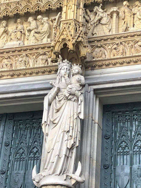
For much of the early medieval period, the Church was the patron of the arts, and it shows in the Romanesque and Gothic Cathedrals. Reading this book, you get the sense that a cathedral is just a big church in a big town. (p. 174) However, any big town could have a big church; what makes a cathedral special is it is the center of an (arch)diocese and the seat of the Bishop. The introduction to "Gothic" comes closer, mentioning that Bishops were, often, political appointees. But it never identifies the cathedrals as the centers of their domains. But while it discusses the basic architecture, it never really goes into detail, even about the stained glass and statuary that depicted stories of the Old Testament, Gospels, and saints. The church building was a way for the illiterate to "read" the Bible - one would expect this to be mentioned in a book with a Christian teaching base.
 |
| Kölner Dom/Cologne Cathedral |
Additionally, one page is dedicated to the Cologne Cathedral.
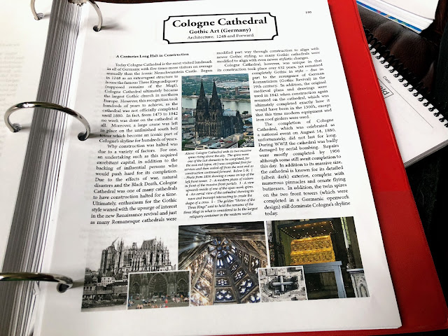
Nowhere does the text mention that the Cologne Cathedral, included part of the unit on Gothic style, is a UNESCO World Heritage site. The text is copyrighted 2017, and UNESCO added the Cathedral to its roster in 1996. This is a crucial thing to understand about the Cathedral. The book mentions how it was completed in the 1800s with "modern" iron roof girders, but not that all repairs now - including current restorations - must be made using the original materials. Few of the current restorations are because of WWII damage; it is wear and tear from age and pollution that cause the need for repairs. Residents of Köln say, "We know the world goes on, because the Döm is being refurbished. If it no longer has scaffolding, life is over."
The text mentions "ornated" flying buttresses, but none of the photographs show them. It talks about how the cathedral is very "dark." I can attest from a personal visit that while the vestibules are dim, the central nave glows from the sunlight streaming in during Sunday services.
Student Activities
Even adding in the four assigned papers (five pages each), I don't feel the program will give a particularly good breadth of knowledge. These explicitly assign the student to choose one artist, piece, or style to research.
To make this course more generally in-depth, I think I would assign more frequent (monthly vs. quarterly) but shorter papers (2 pages each) so a student would have a better opportunity to study a more extensive range of topics. Here, I think quantity is preferable to "quality" because it would broaden his knowledge of art and its place in history.
Closing Thoughts
I really wanted to like this program, because I feel, even transcripts aside, a well-rounded education should include the arts. I have another option for Matthew waiting in the wings, but it is a program I will have to build myself in order to reach content and time requirements to count it as a full credit. I admit that it would have been ideal to have something I could just hand him and say, "Do this, please," especially this year as I have a new student transitioning into our homeschool. Perhaps in a group setting, this might be an appropriate course -- each student in the group could take work/period and bring a short presentation to contribute to a discussion. A single-focus five-page paper does allow a student to get in deep with a single idea, but it means risking learning something out of context with the rest of an era of history. Ultimately, I think that this program is more history than art, omits quintessential works under the guise of modesty, and is inadequate for a single student art history course.
©2012- 2017 Adventures with Jude. All rights reserved. All text, photographs, artwork, and other content may not be reproduced or transmitted in any form without the written consent of the author. http://adventureswithjude.com






No comments:
Post a Comment