I totally get that going paperless is a eco-friendly thing, but I also have come to the realization that I am NOT a gadget girl. Don't get me wrong - I enjoy technology, and my kids will tell anyone Daddy is one of the few friends I have that doesn't "live in Mommy's computer." But I am definitely a tactile and visual person, and using electronic devices often backfires. I tried to use my phone as my calendar, but lost track of too many appointments because the only way to see what was going on was to look at each day. Looking at a month-format calendar just showed a bunch of unlabeled dots, and it meant clicking on each day to see if it was a day with an appointment already scheduled or the dot just indicated somebody's birthday. I had so many missed and double-booked appointments from guessing incorrectly that I went back to a traditional dayplanner book. Each month has two pages, and I can see at a glance what is going on on any given day; this grey leather-bound tome is jokingly referred to as "The Family Bible," because much like the real Good Book, you don't do anything without consulting it first. I need to write everything down (the tactile side of me) and then be able to see it all laid out (the visual part of my brain). I also keep a written to-do list, so I can add to/cross off tasks easily. I can see what I've done, what I need to do, and having it on paper means I can make notes with details -- for example, I may have written "duPont, dry cleaner, CVS" on my list, but then I have an arrow and which kids have meds waiting for us at CVS scribbled in the margin. I know that the visual side of me is what thinks the concept of Pinterest is absolutely genius. I can see the pictures that go with the links, and that triggers memory and ideas. I always struggled with a list of bookmarks, because I could never remember what the page was about. With the pins and the ability to see what it is, I am more likely to revisit those bookmarked pages.
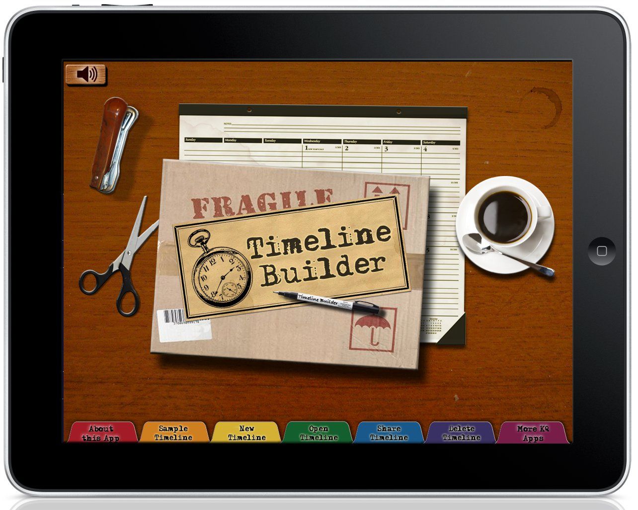
 When given the opportunity to review the TimelineBuilder iPad App (US$6.99, available from the App Store), I was intrigued. Knowledge Quest's webpage shows an example arranging (ancient) historical events into chronological order as an example of how to use it. We're not quite up to that sort of thing in our homeschool - Jude is still working on basic "What comes first? Second? Last?" and is not memorizing history. However, the company's marketing tagline for the app is "Build the timeline you want!" I kept coming back to that idea. I could think of a LOT of things I would want to organize into a timeline. For example - doctor's appointments. I could create a timeline where I could record when we had a particular visit, notes about it, instructions or further tests to do, and when to come back. It wouldn't replace my calendar for scheduling, but it would make a really good visual to-do and note list. Plus, I could download the doctors' photos from duPont's staff CVs are listed, and use that as the photo for each entry. If Neal ever had to take kids to the doctor alone (usually that's my job), he would at least have a face to match up when a doc walked in. (Some of our docs he has never met, because he has had to work. Somebody's got to earn the copay, right?) Hmm...
 Then I thought about my Crew Reviews. I have a blogging binder where I keep a monthly calendar, and then a weekly to-do list, but it's big and bulky. I'm not ready to give that up, but it's not something I can toss into my tote bag. Having a timeline on my iPad was an interesting idea -- I could see what was coming up, jot down ideas about what I wanted to include in my reviews, and then keep track of projects, all on a device I already carry around me me everywhere.
I first started by inputting the reviews I had already completed, and the vendor pictures that go with them. I probably didn't need to, but I would have feel like I only had done half a job of logging if I did not.
Then I started looking to the future. For the completed reviews, I put the date they had been posted. For future ones, I started putting the dates that new posts were due within, leaving the picture as the auto-included Timeline Builder picture. As I completed the review and posted it, I changed the date from the "review period" to "date posted,"and changed the picture to one of the product. This way, I could tell at a glance what was complete and what was upcoming. Not quite a calendar, but a way to see things written out in an orderly fashion. Plus, it gave me a to-do/already-complete list.
As I was reviewing products, I was able to include in the "description" area notes I wanted to include about a program. So here's a way to contain my to-do list margin scrawl.
At first my timeline was getting really crowded, but then I found if I used the zoom feature, I could increase the size of the points on the line to where I could keep about a month's worth on the screen at a time. This worked well because I was able to visually see what was due within that period. I could also slide along the timeline so that I could see not just "within the calendar month" but whatever period of time I determined was useful. While I'm still keeping my calendar since I use it to manage all of my blog posts, I can see at a glance what is coming up in the next review or two so I can start working on my as-I-go drafts.
February's reviews at a glance:
This one shows about 6 weeks' worth of recently posted reviews, plus the next few upcoming ones.
So color me impressed.
Luke also gave the App a try-out. He struggles with organizing assignments -- while he is fine with understanding "The project is due on this day," he often forgets to plan between-steps when focusing on "end product." He has a research paper do for his English class; his topic is "Friendship in the Wizard of Oz." He created a timeline for the projects' requirements over the course of semester.
He entered first the assigned due dates, since they were required submissions for a grade. Then he went back and broke the between-assignments task into smaller chunks, and set "goal" dates for between steps. For example, he knows that it is important to write an outline - it is the backbone of your paper. However, that wasn't something to be turned in, so it could easily have been overlooked. He set that as a "goal." He is in the upcoming school production of Beauty and the Beast, and the performances are the weekend before the final paper is due. He set Opening Night as his goal to have the paper nearly done, so he would only have to do minor revisions and a final proofread this weekend and early next week. He chose his pictures as visual mnemonics - for example, the paper is on The Wizard of Oz, so Dorothy and her companions are the "standard" pictures, an image of an outline for that goal, and Chip the Teacup to mark the show date because that is the role he playing. He has not really edited his timeline once he put it together like I have done, but has used it as a combination checklist and pseudo-calendar.
According to the product's webpage, this App costs US$6.99. However, at the time this review was posted, the App Store lists it as $4.99. To use this program, you must have an iPad using iOS 5.0 or later.
I really liked using this app. These were the two big projects we did with it, but we have also been able to use it for smaller things. Luke kept a rehearsal schedule/timeline that tracked goals for script memorization and when he needed to acquire costume items. While it did not work as a "daily timetable" schedule, I was able to use it on some days to track who needed to be where and when during a day or week by just being able to manipulate where to drive first, next, and last (helpful when you have five children going in four directions!). I have plans to try to use it as a type of progress/grade book for Jude in the future. It is intuitive to manipulate and simple to use, but most importantly, it keeps things organized in a way that is useful to me.
The Crew reviewed two Knowledge Quest items - the TimelineBuilder iPad App and the Sacagawea (Brave Explorers Every Child Should Know) Complete PDF e-book. Click on the banner to find out what families thought of these Knowledge Quest products!

©2012- 2013 Adventures with Jude. All rights reserved. All text, photographs, artwork, and other content may not be reproduced or transmitted in any form without the written consent of the author. http://adventureswithjude.com


Wow - that was pretty creative!
ReplyDelete